Posts

Blog Redesign

Image
Per Mike Scott's instruction, this blog will be undergoing a redesign.  There will be different pages for different topics (i.e. a page for drawings and prototypes and a different page for responses) to help make the content more accessible.   

Good design Doesn't Make People Happy

Image
The article discussed can be seen here This article asked us to put aside, almost unlearn, the habits and processes we learned this semester.  It had a similar message to the article we read about Facebook's redesign a few years ago , which said that a good design will win out and ultimately make people 'happier'.  This article added on to that sentiment that making a client happy is not necessarily part of the designer's job, that by fulfilling their needs instead of their arbitrary desires, a better product is created that will better accomplish the original goal.  This article seems to be in direct opposition with the conversation we had will Will Seyffer (Designer at Facebook) who talked about how fully empathizing with customers allowed for a better design to form.  While I think that empathy can be useful, I think that assessing the needs and almost dismissing the whims of the client would result in a more well rounded finished design. Discussion Qu...

Zero UI

Image
The article discussed can be viewed here The internet of things is getting closer to becoming reality with the rising popularity of devices like nest thermostats and amazon echo. However I disagree with the article’s statement that screens will become obsolete. Because we are such visual creatures, I don’t see a world where people completely abandon screens and interact with technology solely using voice control. Discussion Questions: Will zero UI and the Internet of Things it's associated with have to come with an ability to opt out?  How would the different styles of interaction work with eachother? There are often connections made between the movement towards the Internet of Things and dystopias such as those shown in Brave New World, the Circle, and 1984.   How likely is it that the Internet of Things will result in the downfall of society?

UX is UI

Image
The article discussed can be found here As much as the article read as an angry rant against anyone and everyone, I think there were some important distinctions made as to the nature of designing for users. Based on my experience this semester, I think that UX is an umbrella term that encompasses many things including UI. Most, if not all of the projects we completed over the semester placed a lot of emphasis interfaces. Although we were told to ‘design an experience’, we were reprimanded and told to do it again if the user interface was not up to snuff. The different facets of user experience design are too intertwined to be able to only focus on one small aspect such as interface design. Therefore it must fall under the UX umbrella as something that is important to the finished product but cannot be developed independently. Discussion Questions: The meme provided in the article shows a paved walking path and a beaten path through the grass leading to the parking, which l...

Simple UX design

Image
The article discussed can be read here I liked that this article gave a concrete qualifier to 'simple' design, because that is a concept I have been struggling with all semester; the article suggests that in a design sense, 'simple' is often interchangeable with 'clear'.  'Simple' is a hard goal to achieve, but 'clear' is a bit more straightforward and doable.  Clear design is a design that can be complex if needed, but limits the user's cognitive load and is largely self explanatory, be that through layouts, chunking workflows into more discrete areas, or other strategies.   // further discussion awaiting the author actually having time // Discussion Questions: The iPhone is often held as the pinnacle of simple design.  What have they done that is so special? What are some user experiences that are not web or mobile based that either have a high level of clarity or are very difficult to navigate?  What aspects affect t...

Page Parking

Image
The article discussed can be found here As I started reading this article, I realized that I seemed to be using the browsing technique being discussed, or at least a blend.  I have an online scrum board open all the time, but add tasks as I need them.  Tonight I opened Slack and immediately opened the articles I had to write responses to, not to read them all piecemeal but to remind myself what it is that I have to do.  I then opened Blogger and moved that tab around as I finished reading articles so that they were separated for easier referencing.   I think that the generational difference in browser use makes sense. Older generations use the web in a manner similar to that of a library, where you are essentially forced to do what the article calls 'pogo sticking' which is finding a source, digesting the information, then moving to a new source.  Younger generations who grew up using the internet are better equipped to use a browser as a sort of...

Empathy driven designs

Image
Discussed article can be viewed here   This article is an op-ed piece that we were also assigned to read in NMD 102 last year.  The first time I read it last year it was extremely challenging.  This time through it is still a challenging read due to the writing style, but I have discovered that part of my struggle last year was that I was not familiar with any of the language used in the UX field.   The ideas presented in the article are supporting the importance of an empathy driven design process, something also stressed by one of the guest speakers for NMD 442, Stephen Crowley.  Both claim that good design is not possible if a) the designer's bias is not removed as much as possible, and b) the design is not focused on solving a specific user problem.   I think it is easier to focus less on maximizing empathy and focus more on removing one's bias and focusing the product towards a specific problem.  A large part of this is ...

Storyboarding study

Image
The discussed article can be found here This article was a writeup of a study done at Tufts university.  I will admit that I skimmed much of it due to poor time management and necessary prioritization, but I did closely read the results.  The results were focused on effective storyboarding techniques, and while the results were similar to what had been established in class, it was good to see written confirmation that our gut instinct was more or less correct.   An effective storyboard briefly explains the problem and the proposed solution. It does not have extraneous detail, has enough frames to explain the idea but not enough to confuse, and will often have small bits of text to add more context and to clarify the situation.   Discussion Questions: Would a video be an effective storyboard?  Or would that be a different thing altogether? Is a storyboard a user experience in itself?  As such, would making a successful one re...

Final Project Idea

Image
The final project for this class is a packet outlining a user experience, including personas, storyboards, and experience narratives.  It is supposed to be something we are intimately familiar with and something we care deeply about. I am intimately involved with art and theater, I am actually writing this as I wait for an audition. I would like to create an idea for something to assist people as they prepare for auditions and learn their lines.  Auditioning for productions and then preparing to actually perform is stressful and challenging.  There is a lot of pressure to memorize blocks of text, choreography, even emotions as quickly as possible.  Having either a mobile or desktop app that could assist with line memorization would help alleviate some of that stress.  The main feature of the app would be a simulation of another person reading along with your lines, like a prompter.  It would use a combination of uploaded text, text to speech, and spee...
Prototype embedding attempt

Image
the service can be accessed here For the app development project (my part of that project is detailed here , while my partner's is detailed here ), we made a prototype using a service called, a platform designed to facilitate product design and prototyping.  Once the prototype as been made, there are different ways that it can be shared.  There is a shareable link  that can be used on a desktop or mobile device, there is the InVision app that can support the prototype as if it was an actual app, and hypothetically, a way to embed the prototype into a Twitter or blog post. This is an attempt to embed the prototype into a blog post.  It does not work, nor does it successfully embed into a Twitter post.

Snow Plow App production

Image
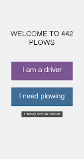
The complete prototype can be viewed here My classmate and I were paired up to work on designing an app that would work as a way to connect people with snow-filled driveways and plow guys.  I have been working on generating the prototype to show to potential developers and/or user.  I did this using photoshop to make the screens, and then putting them into a prototype generator called inVision. When we were discussing how we wanted the app to function, we heavily referenced the About.me onboarding system, but integrated some of the critiques we had of it, namely the ability to see how long the process will be and navigation between tabs of the process.  The design we came up with uses a series of dots on the bottom of the screen, as shown. The current screen's dot is highlighted in yellow, showing the user where they are in the onboarding process.  If the user wants to go back to a previous page, they simply tap on the associated dot and it brings them ba...

Designing Dark Patterns

Image
  Click here for article This article discusses some of the most irksome 'dark patterns' often found in UX.  I selected this article mainly because of the Star Wars reference in the beginning, but I also liked the points it brought up.  At the beginning of the semester I spent 3 hours dealing with Adobe customer service because it looked like they were automatically continuing my Creative Cloud subscription(at more than 100 dollars more than I initially agreed to).  Upon investigation, I had agreed to these terms in the fine print of the student discount promotion.  When I tried to cancel my account, there was no way to do so on the website.  I had to spend more time dealing with customer service, who didn't let me cancel, but did give me the discount again.  This cycle of payment is not sustainable, the only way I managed it this year was that I had gotten a different debit card between automatic payments.  In a utopian view, I do not have...

Dead End UX

Image
Click here for the article The article focuses on FaceBook's personalization and the idea of 'dead end UX'  The author has turned their FaceBook feed into effectively a news reader by unfollowing all of their friends.  Now they are unable to undo this action, making Facebook unusable.  The follow/unfollow feature of FaceBook is something my family and I have made great use of in the past year, with some unforseen consequences that are similar to those encountered by the author.  Last election season, my mother unfollowed her mother because the daily unintentionally racist posting was becoming too much.  A couple months later my great uncle died and my grandmother posted about about his death, which my mom obviously did not see.  I had to call my mom to tell her so that she in turn could call my grandmother to give her condolences.  If I hadn't done that, my mother would not have known about her uncle's death and would have ended up hurting my gr...

Stanford Design School Design Process

Image
Click here to view article The way the process was broken up made it easy to understand and glean useful information from, which was appreciated.  There wasn't really any new  information, it mostly just cemented things we had discussed in 102 and in class discussions in this class.  Discussion Questions: Is it possible to design effectively without true empathy? Rather, is there a way to imitate empathy? What tests could we devise to use with this SnowPlow Uber idea? What would an effective prototype look like for the Snow Plow Uber?

About.me questions

Image
Click here to see the page I made for class While making my about.me page, I was impressed by how smoothly the user was guided through the process.  While there were a couple things I did not like(you were unable to see some content, and it wasn't easily apparent how a bio was formed or the page made more usable in general), the overall experience and product was simple and effective.   Questions: Is there a reason for the color choice?  Why isn't there an integral navigation system? What tests did were used for this and how were they implemented? I originally started the process on my phone, didn't finish, and ended up completing it on my laptop.  Something I noticed throughout was that it looked as if it had been designed for mobile use.  Was it? Is there anything you would do differently in designing this?

Glossary of UX terms [ongoing]

An ongoing glossary of UX terms that will be updated as we learn more. 5: five second test a form of usability test where the user is shown a web page for 5 seconds and then asked questions to determine the clarity of the website. A: B: C: D: E: F: G: Guerrilla User Testing According to  Martin Belam, "Guerrilla usability test is “the art of pouncing on lone people in cafes and public spaces, quickly filming them whilst they use a website for a couple of minutes.” H: I: Iterative design the process of repeatedly redesigning a product based on user feedback. J: K: L: M: N: Needfinding A process of determining what a user actually needs a product to do.  This information can be found using questionnaires (explicitly determined) or through usability testing (implicitly determined). O: P: Prototype A mock up of a product that evolves closer to the actual product over time(low fideli...

Dark UX

Image
The article this post is responding to is no longer able to be found, so the hyper-link has been removed to avoid confusion. The article raises some interesting points if you look past the all too common concerns about internet addiction, namely is there a responsibility to avoid falling into 'Dark UX'?  The idea of dark UX is that people who know certain design tricks such as making specific buttons larger, or changing an animation to make scrolling smoother (i.e. UX designers) can use these tricks to make using an app more mindless and... well addictive is really the only word that comes to mind.  The final parts of the article discuss the role of the UX designer: should there be a sort of expectation to do no harm?  Or should it just be accepted that as they are contractors, they will do what the client asks? I think that a pseudo Hippocratic oath for UX designers is a nice idea, but not entirely practical.  The job of a UX designer is to make an experi...

Redesigning the FitBit app

Image
click here for article First off, the idea of guerrilla usability testing is extremely funny to me:  a method of  testing a website or app that involves "pouncing on lone people in cafes and public spaces, quickly filming them whilst they use a website for a couple of minutes.”  The mental image is ludicrous enough to actually seem feasible.   As for her actual prototyping and redesign process, there were again some interesting takeaways for me.  The job stories that allow you to better analyze what people want to do with an app was a practice I had not thought of, and the idea of 'pain points' seems like a useful tool that I will be able to utilize in my job.  The discovery of the pain points provides specific goals to troubleshoot, as opposed to wandering blindly, which I appreciate.   Discussion questions Would guerrilla usability testing be feasible for the snow plowing app? why/why not? What tasks would it make sense t...

Case Study: Mobile App UI Design Process

Image
  Click here for articl e I appreciated how the article laid out a process of app creation in very simple layman terms, it helped me feel more confident in how to approach our snow plow Uber project.  Based on the article, we've already taken some of the initial steps, i.e. the 'elevator pitch' of "It's like Uber but for plowing."  I enjoyed the examples the author gave of her sketches and how she showed their transition into a fully formed prototype.  I think I like the style tile model better than the mood board just because it seems more fleshed out and easier to apply to a product.   Discussion Questions: What would the snow plowing project have as a design inception sheet?  What sort of moodboard/style tile would it have? How could you make sure the visual language used in the product resonates with the largest number of users?  Are there certain aspects that are interpreted the same regardless of who looks at them?  O...

Google HEART

Image
Click here for article The metrics Google created for its designers to use as a guideline, HEART, is part of what makes the Google suite so powerful and pervasive.  The goal of the rubric is to build a system that is more effective at carrying out its intended purpose[Task success] thereby satisfying a user[Happiness] as well as encouraging them to want to use it more often[Engagement], become loyal to it[Adoption], and to continue to use it[Retention].  The result of this is the Google suite that has become standard for school systems, workplaces, and personal affairs.  I have not used Microsoft office since my sophomore year of highschool, mainly because using Google Drive is simply easier and more convenient; I can access whatever I'm working on from any computer or smartphone that has an internet connection.  The Google suite is simple and nearly seamless to use, and upon finding their rubric for product development, how they achieved this product makes mo...

Netflix A/B testing

Image
Click here for article After reading this article multiple times I was left with a general feeling of confusion.  I generally don't like ucdesign.cc's articles.  They tend to be poorly written and difficult for me to understand.  I was able to glean some interesting things out of the article however.  I did not know that Netflix followed the scientific method while executing product tests, and while it makes perfect sense, it is not something that had occurred to me as a possibility.  One of the graphics in the article was intriguing because I could see exactly why it had the results that it did. I first saw the image when I skimmed the article and had a visceral reaction to the default artwork.  It just feels like there is too much motion and chaos in the image, whereas the most popular image is extremely visually appealing. Discussion Questions: One of Chen's points was to pay as much if not more attention to what a user does  as w...

Understanding your users mental model

Image
Click here for article I thought that the source of this article was interesting because it was written by the director of research of Intercom, the website that produced the article.  In part of the article she discusses how sketching revealed a critical problem with the development of their company's product; the people working together on it did not have a common goal or vocabulary with which to discuss it, and no-one really had any idea until they did this sketching exercise.  I like seeing how the way that I think and process information is something that can be used in professional settings, not just me explaining my weird idea for a two-headed dragon to someone.   Completely unrelated to the actual article, but the animation of the line that told the reader how close to the end of the article was really well implemented.   Discussion Questions: What would the 'dog bone' look like for someone who lived on campus?  If there were to be a...

Metrics Versus Experience

Image
Click here for article I thought that the name of the article (Metrics Versus Experience) was interesting simply because the first point of the article was "don't frame stuff as 'Metrics Versus Experience.'"  The actual content of the article was a nice insight into something I am only barely aware of:  the metrics used to analyze the success of a website or product.  I have interacted with them in terms of Instagram(there is a feature that lets you see how many people have seen a post and how many people have interacted with a post, and how those numbers stack up against your other posts) and Google analytics(which lets you see where people who access your website are from and how they are getting to the site), but I have never had to use them to better execute a product.  In Zhou's article, she talks about different ways to figure out which metrics you should actually track, and I liked the way she explained it because it's similar to the way I te...

Sketch Assignment number Two

Image

Dan Norman's Ted Talk

Image
The concepts discussed in Dan Norman's were interesting because I hadn't consciously noticed them, but as soon as he brought up an example it made total sense.  It reminded me of Bill Moggridge's iceberg metaphor-- I subconsciously understood, appreciated, and experienced these elements but never applied conscious brain effort into noticing them.  That is a skill I want to work on in the future: making a concerted effort to look at the design that goes into what I encounter on a day to day basis.   I like to think of myself as a sort of designer, as I have been masterminding my own knitting and sewing projects for years.  More recently I have been trying to extend my design work into app and/or game design, and I think that the elements of design he outlines, specifically the visceral and behavioral elements will be useful to keep in mind and cater to in that work.       

More Bill Moggridge

Image
Bill Moggridge's talk about his book 'Interaction Design - Beyond Human-Computer Interaction' A short series of eulogies. The Moggridge videos we watched this week were useful in that they gave more context to the first one we watched('What is Design?'), which looks to be a condensed version of his Stanford talk (Designing Interactions).  I liked the interviews that he filmed and included in the talk;  hearing more about the design process that went into Google's home page was fascinating, especially their system of adding things.  I had not given any thought to how streamlined a search engine really should be, I think that may be part of what I dislike about Bing.  Bing's home page is cluttered with images and links, making it less appealing to use. Bing's homepage The second video, the compilation of people's remembrances, didn't really provide any technical knowledge, instead it provided more insight on who Moggridge was.  Th...

Sketch assignment number one

Image
At the beginning of the semester, we were asked to complete some sketching exercises.  The first was to draw 10 methods for phones to share files.  They were not required to be realistic or feasible.

Reflection on 'What is Design' and chapter one of 'Interaction Design - Beyond Human-Computer Interaction'

Image
What is Design?  lecture by Bill Moggridge Based on this week's assignment, I think I will find the textbook helpful due to the technical information it provides, but will find the videos and articles a better source for concepts and ideas. I really appreciated the the model of phone call services and the activities presented in the text; I think that they provided a way of thinking about design that I will be able to apply to challenges given in class. The list of roles that emerged as interactions became more complex and required more diverse skills was interesting, I had never heard of an information architect or a usability engineer, but those roles being specialized ones makes a lot of sense. Bill Moggridge's talk was helpful in that it cemented some concepts that I had a tangential grasp on, as well as pointing out things I had barely considered.  I think my favorite thing he talked about was his iceberg metaphor: that the things that can be consciously taught a...