Netflix A/B testing

After reading this article multiple times I was left with a general feeling of confusion. I generally don't like ucdesign.cc's articles. They tend to be poorly written and difficult for me to understand. I was able to glean some interesting things out of the article however. I did not know that Netflix followed the scientific method while executing product tests, and while it makes perfect sense, it is not something that had occurred to me as a possibility. One of the graphics in the article was intriguing because I could see exactly why it had the results that it did.
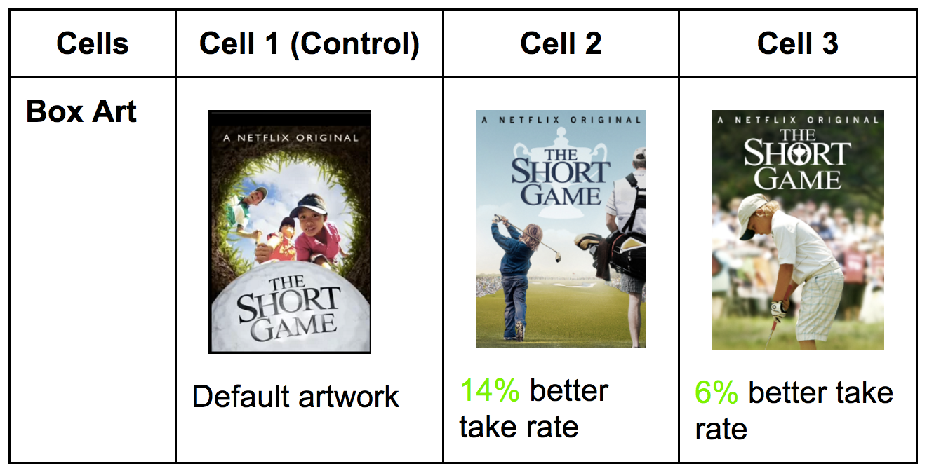
I first saw the image when I skimmed the article and had a visceral reaction to the default artwork. It just feels like there is too much motion and chaos in the image, whereas the most popular image is extremely visually appealing.
Discussion Questions:
One of Chen's points was to pay as much if not more attention to what a user does as what they say. In terms of Netflix, what would people say they used one way when they in fact use it another way?
Is there a reflective aspect of the actual act of using the Netflix interface? or does it end up eclipsed by the experience of watching the content?


Comments
Post a Comment