Case Study: Mobile App UI Design Process
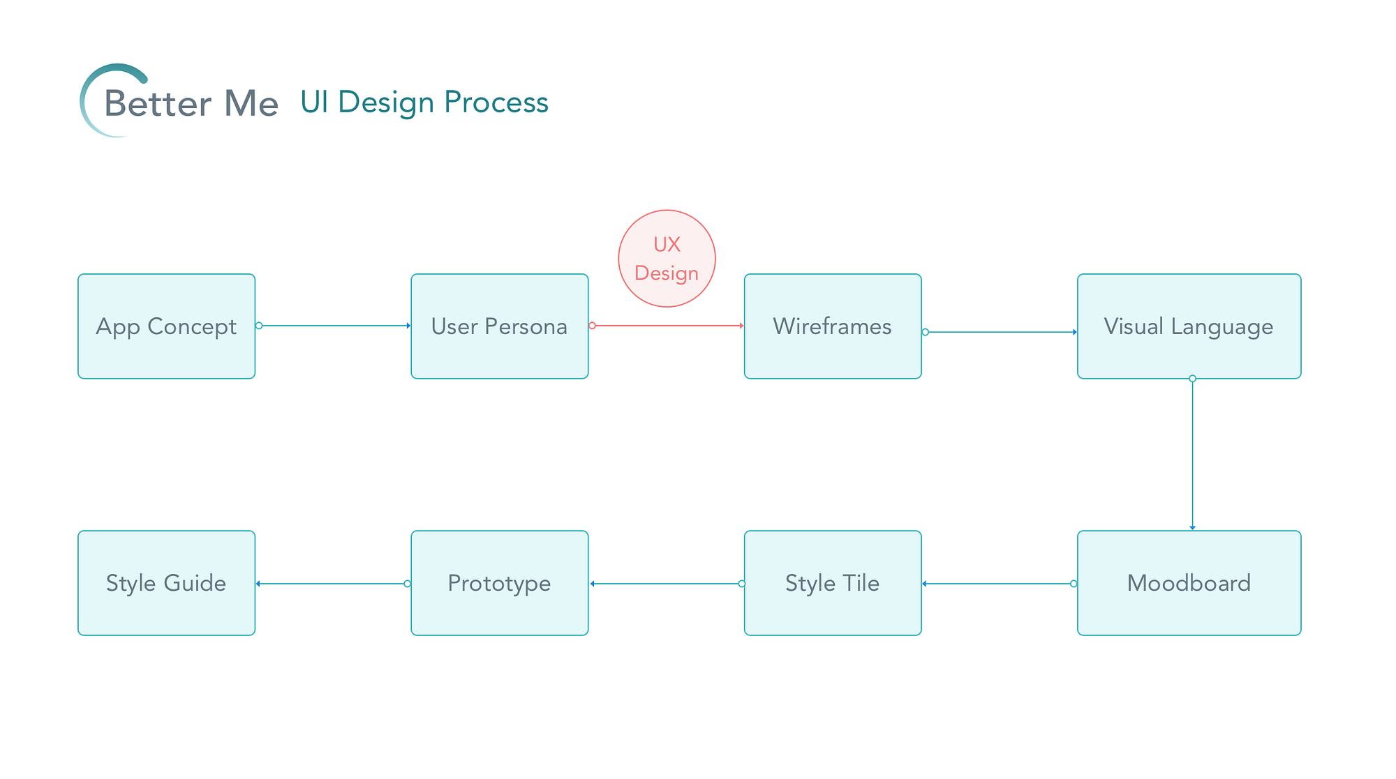
I appreciated how the article laid out a process of app creation in very simple layman terms, it helped me feel more confident in how to approach our snow plow Uber project. Based on the article, we've already taken some of the initial steps, i.e. the 'elevator pitch' of "It's like Uber but for plowing." I enjoyed the examples the author gave of her sketches and how she showed their transition into a fully formed prototype. I think I like the style tile model better than the mood board just because it seems more fleshed out and easier to apply to a product.
Discussion Questions:
What would the snow plowing project have as a design inception sheet? What sort of moodboard/style tile would it have?
How could you make sure the visual language used in the product resonates with the largest number of users? Are there certain aspects that are interpreted the same regardless of who looks at them? Or is there necessarily a learning curve?
The article quotes Massimo Vignelli, saying "Styles come and go. Good design is a language, not a style." Are there conventions that have stopped being viewed as good design?


Comments
Post a Comment