Designing Dark Patterns
 |
| Click here for article |
This article discusses some of the most irksome 'dark patterns' often found in UX. I selected this article mainly because of the Star Wars reference in the beginning, but I also liked the points it brought up. At the beginning of the semester I spent 3 hours dealing with Adobe customer service because it looked like they were automatically continuing my Creative Cloud subscription(at more than 100 dollars more than I initially agreed to). Upon investigation, I had agreed to these terms in the fine print of the student discount promotion. When I tried to cancel my account, there was no way to do so on the website. I had to spend more time dealing with customer service, who didn't let me cancel, but did give me the discount again. This cycle of payment is not sustainable, the only way I managed it this year was that I had gotten a different debit card between automatic payments. In a utopian view, I do not have to think about my subscription at all after the initial onboarding process: which is a good thing, except when I lose control of my charges and continued patronage.
Discussion questions:
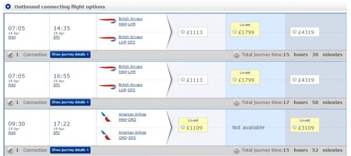
One of the points the author brought up was 'misdirection', and included the above image as well as the prompt to "Take a profound look at British Airways’ website and decide which price is really the lowest" I am completely unable to figure it out. What are they talking about?
How do we decide on limits in UX, and who should decide those limits? UX has a goal of making a seamless and engaging experience, what effect would putting restraints on designs have?
Would we as a population actually want these restrictions? We have become so used to everything we do online being streamlined and near mindless, would we respond positively to having to manage our online programs and assistants?


Comments
Post a Comment