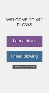
Snow Plow App production
 |
| The complete prototype can be viewed here |
When we were discussing how we wanted the app to function, we heavily referenced the About.me onboarding system, but integrated some of the critiques we had of it, namely the ability to see how long the process will be and navigation between tabs of the process. The design we came up with uses a series of dots on the bottom of the screen, as shown.
The current screen's dot is highlighted in yellow, showing the user where they are in the onboarding process. If the user wants to go back to a previous page, they simply tap on the associated dot and it brings them back to the page. Users are unable to skip ahead so as to ensure that all the information is gathered.
The current screen's dot is highlighted in yellow, showing the user where they are in the onboarding process. If the user wants to go back to a previous page, they simply tap on the associated dot and it brings them back to the page. Users are unable to skip ahead so as to ensure that all the information is gathered.
We chose our colors (shown below) knowing we wanted an off white and a very dark grey for the base colors. The blue and purple were selected to aid in strengthening the ties to ice and snow, while the yellow provided both a nice contrast and a nod to the fact that this is an app for plows. We kept the yellow fairly muted and cool to avoid making the app garish.
This project has added to my toolkit by forcing me to learn how to use different platforms. I was originally going to build the prototype in Unity using GUIs and then install it into a phone, however I decided that learning to use tools that were actually designed for this sort of project would probably be more valuable. In the end I am glad that I chose to do this, as I was able to make a better looking app prototype. InVision allows you to build for many different platforms so I can definitely see myself using it again. Paletton allowed me to make a far more professional looking palette than my original palette(below). This paint blob approach was helpful in the beginning because it let me see how the colors looked next to each other, but would not have been appropriate to show in a professional presentation.
 |
| Palettes made using Paletton |


Comments
Post a Comment